A Series on Building Formal Models of Classic Psychological Effects: Part 1, the Dunning-Kruger Effect
Introduction
The Dunning-Kruger effect is perhaps one of the most well-known effects in all of social psychology, defined as the phenomenon wherein people with low “objective” skill tend to over-estimate their objective skill, whereas people with high objective skill tend to under-estimate their skill. In the popular media, the Dunning-Kruger effect is often summarized in a figure like the one below (source):
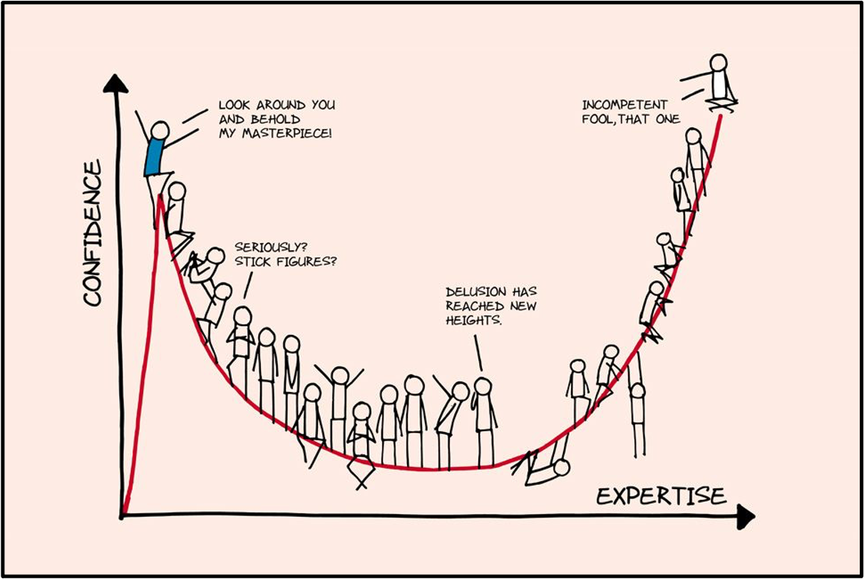
Caption: The Dunning-Kruger Effect in Popular Media
Despite the widespread use of figures such as the one above, the specific form of the effect is misleading–it suggests that people with low objective skill perceive their skill to be higher than those with the highest skill, which is not what Dunning and Kruger actually found in their original 1999 study. As clarified by many others (e.g., see here), Dunning and Kruger actually found the following:
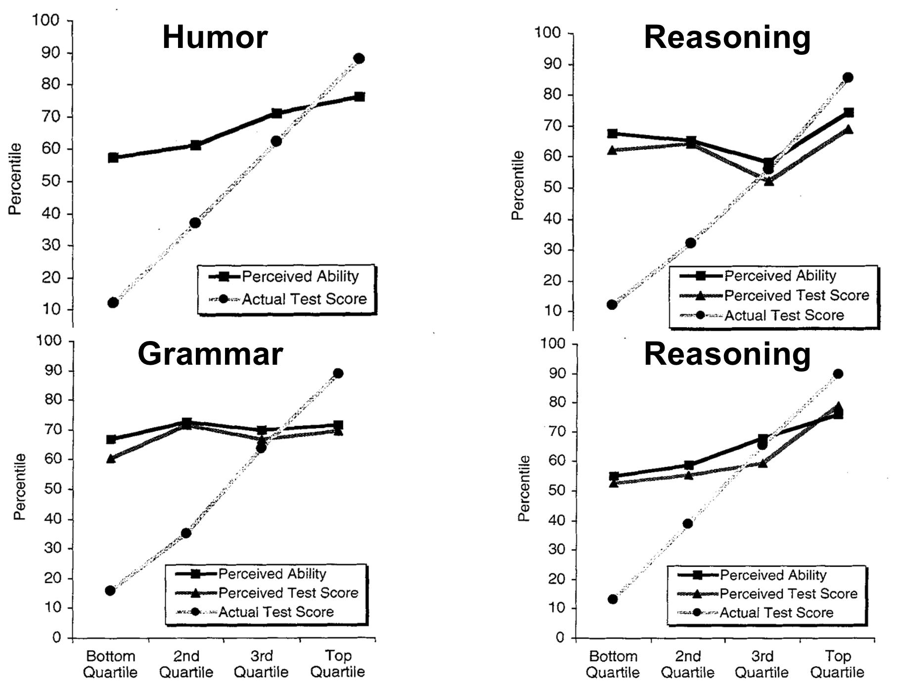
Caption: Original Data from Dunning & Kruger (1999)
The basic pattern across all these different domains is consistent with our original definition of the effect–that people with low objective skill tend to over-estimate their skill to quite a large extent, yet those with high objective skill under-estimate their skill, but to a lesser extent. However, unlike the popularized interpretation, the relationship between objective and perceived skill appears to be monotonic, such that, on average, people with low skill still perceive themselves to be less skilled compared to high-skilled people.
Regardless of misinterpretations in the popular media, the notoriety of the Dunning-Kruger effect cannot be understated. As of January 2021, the original study has been cited upwards of 6500 times on Google Scholar alone, and the basic Dunning-Kruger effect has been consistently replicated across samples, domains, and contexts (see here). In many ways, research on the Dunning-Kruger effect theorefore embodies the highest ideals of contemporary psychological science, passing the bar on replicability, generalizability, and robustness that psychological scientists have been striving for since the advent of the replication crisis (see also here).
There is just one small problem…
Wait, the Dunning-Kruger Effect is just Measurement Error?
Perhaps surprisingly, the traditional methods used to measure the Dunning-Kruger effect have always been heavily scrutinized–even the original authors acknowledged potential issues with measurement error. Specifically, it is unclear to what extent that the classic effect arises due to an actual psychological bias, versus more mundain statistical measurement error resulting from regression to the mean. In fact, in their 1999 article, Dunning and Kruger explicitly recognize this possibility (p. 1124):
“… the reader may point to the regression effect as an alternative interpretation of our results. … Because perceptions of ability are imperfectly correlated with actual ability, the regression effect virtually guarantees this result. … Despite the inevitability of the regression effect, we believe that the overestimation we observed was more psychological than artifactual. For one, if regression alone were to blame for our results, then the magnitude of miscalibration among the bottom quartile would be comparable with that of the top quartile. A glance at Figure 1 quickly disabuses one of this notion.”
Although Dunning and Kruger were willing to state their belief that their results were attributable more so to psychological rather than statistical effects, they did not provide an explicit generative model for their pattern of results. Their reasoning appears sound (i.e. that differences in magnitude of mis-estimation for those under/over average indicates something beyond regression to the mean), but without a generative model, it is unclear how much faith we should place in the authors’ beliefs.
Simulating the Dunning-Kruger Effect
Fortunately, a number of simulation studies have since been conducted to show exactly how measurement error can generate data consistent with the Dunning-Kruger effect. Ackerman et al. (2002) was one of the first, which showed how the pattern found in Dunning and Kruger’s original study could arise from plotting any two variables with less than a perfect correlation (i.e. \(r=1\)) using the objective skill quantile versus perceived skill percentile convention from the original study. For example, if observed objective skill and perceived skill are correlated at \(r=.19\), using the standard plotting convention, Ackerman et al. (2002) obtained the following pattern:
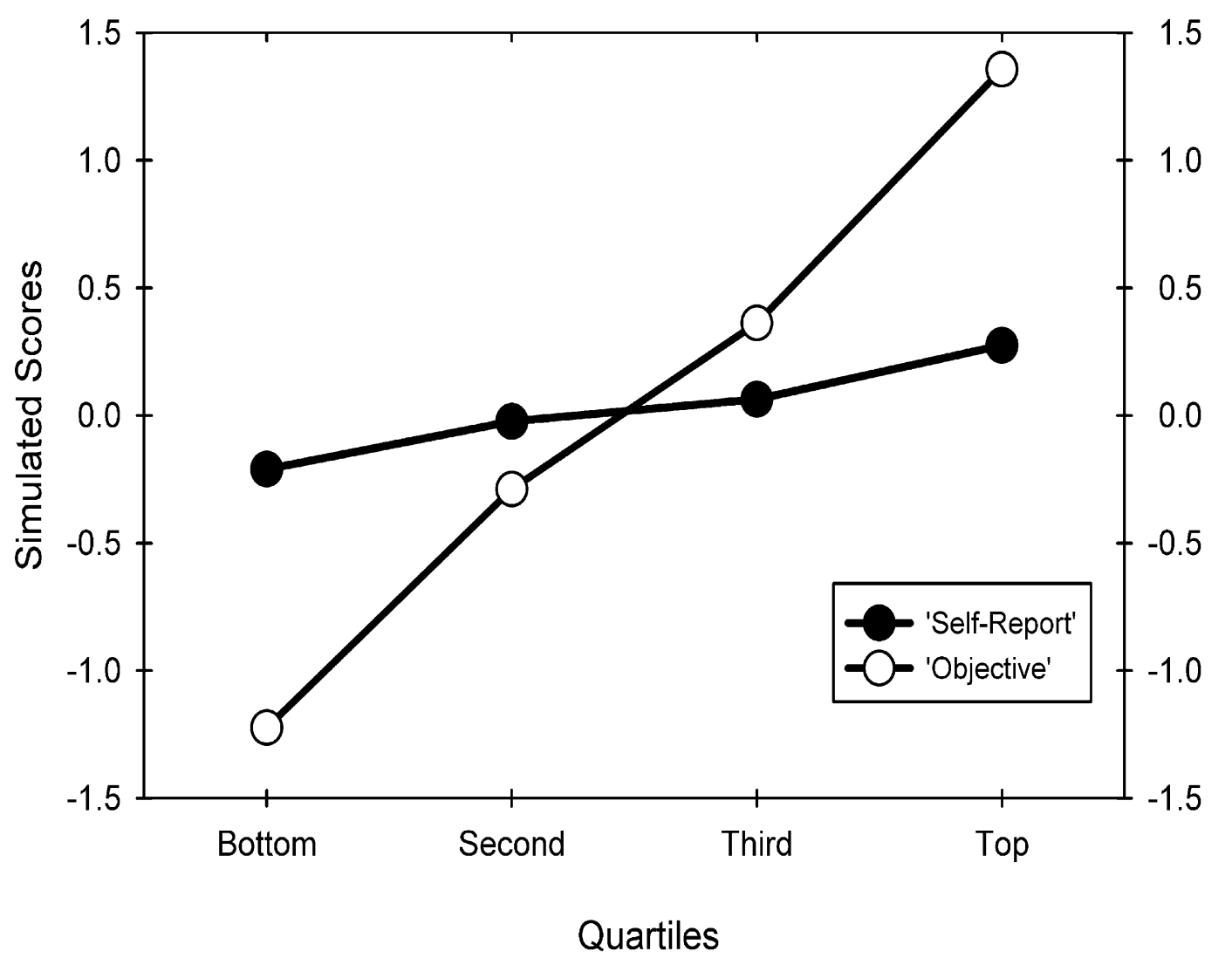
Caption: Figure 1 from Ackerman et al. (2002)
The take-away from the above results is that any less-than-perfect correlation between two variables will produce the general pattern found in Dunning and Kruger’s original study, which results from a statistical phenomenon termed regression to the mean. If the concept of regression to the mean seems a bit magical (it certainly was for me when I was first introduced), it is useful to simulate data to get a sense of what is going on. The R code below replicates previous simulation studies, but at three different correlations between objective and perceived skill:
# Libraries we will use throughout the post
library(mvtnorm)
library(dplyr)
library(tidyr)
library(ggplot2)
library(gghighlight)
library(patchwork)
library(foreach)
library(rstan)
library(bayesplot)
library(hBayesDM)
library(httr)

# RNG seed for reproducing
set.seed(43202)

# Number of simulated participants
n <- 100

# Group-level means/SDs on "objective" and perceived skill assessments
mu    <- c(0,0)
sigma <- c(1,1)

# Three different correlations between objective and perceived skill
obj_per_cor <- c(0, .5, 1)

# Simulate data
sim_dk_plots <- foreach(i=obj_per_cor) %do% {
  # Make correlation matrix
  R <- matrix(c(1, i,
                i, 1),
            ncol = 2)

  # Construct covariance matrix
  Epsilon <- diag(sigma)%*%R%*%diag(sigma)

  # Simulate correlated data
  sim <- rmvnorm(n, mu, Epsilon)

  # Compute quantiles, summarize and save out plot for given correlation
  sim %>%
    as.data.frame() %>%
    rename(obs_obj = V1,
           obs_per = V2) %>%
    mutate(quantile = cut_number(obs_obj, n = 4, labels = F)) %>%
    group_by(quantile) %>%
    summarize(mu_obj = mean(obs_obj),
              mu_per = mean(obs_per)) %>%
    ggplot() +
    geom_point(aes(x = 1:4, y = mu_obj), color = I("black")) +
    geom_line(aes(x = 1:4, y = mu_obj), color = I("black")) +
    geom_point(aes(x = 1:4, y = mu_per), color = I("#8F2727")) +
    geom_line(aes(x = 1:4, y = mu_per), color = I("#8F2727")) +
    annotate("text", label = "Objective", x = 2.5, y = -1,
             color = I("black"), size = 5) +
    annotate("text", label = "Perceived", x = 1.8, y = .5,
             color = I("#8F2727"), size = 5) +
    ggtitle(paste0("r = ", i)) +
    xlab("Quantile") +
    ylab("Score") +
    ylim(-1.7, 1.5) +
    theme_minimal(base_size = 15) +
    theme(panel.grid = element_blank(),
          plot.title = element_text(hjust=.5))
}

# Plot objective versus perceived quantiles
sim_dk_plots[[1]] | sim_dk_plots[[2]] | sim_dk_plots[[3]]
Very interesting! We are able to replicate the simulation studies from before. More importantly, the interpretation of the Dunning-Kruger effect is not looking so good. As in previous simulation studies, our simulated data looks strikingly similar to that reported by Dunning and Kruger in their original study, yet our model contains no psychological mechanisms that could produce the effect–the results are purely due to the lack of correlation between objective and perceived skill, which could result from a number of sources including measurement error. In fact, a few recent studies (see here, and here) have used this line of reasoning to claim that the traditional psychological interpretation of the Dunning-Kruger effect is likely incorrect, and a recent scicomm article brought the controversy to academic Twitter (which I participated in, inspiring this post!).
Building a Generative Model of the Dunning-Kruger Effect
A Simple Noise + Bias Model
So far, we have found that the group-level Dunning-Kruger effect can be simulated through regression to the mean, which we expect to see anytime we are observing the relationship between any two variables that have less than a perfect correlation. However, there are two problems with relying on regression to the mean as an explanation for how the Dunning-Kruger effect is generated:
- Regression to the mean alone cannot account for the differences in mis-estimation found in real data between those with high versus low objective skill, and
- Regression to the mean results from the correlation between two variables, but what is it exactly that causes a high or low correlation between objective and perceived skill?
Regarding (1), if you compare the simulated data from either Ackerman et al. (2002) or from our own example in the preceeding section to the emprical data in Dunning and Kruger (1999), you will see that our simulated data indeed misses this difference in mis-estimation. In the emprical data, the perceived skill line is shifted upward relative to what we would expect. Therefore, it is clear that regression to the mean alone will not re-produce all aspects of the traditional Dunning-Kruger effect.
Point (2) is a bit more nuanced, and it is something that we can only really answer by thinking about the data-generating process hollistically. For example, if we assume that there is some latent, underlying skill that leads to both observed performance on an objective measure and perceived performance on a subjective measure, how could this single latent skill produce patterns that are consistent with real-world data? Burson et al. (2006) took exactly this approach, which I term the generative approach (see here, here, and here). They proposed a noise + bias model (see their model specification in the appendix, on p. 77), which assumes that each participant \(i\)’s observed perceived skill rating \(y_{i,\text{per}}\) results from their objective underlying skill level \(\theta_i\), in addition to some noise \(\epsilon\) and a bias term \(b\) that captures over-confidence. Conceptually, there are many ways we could implement such a noise + bias model, but the authors chose to implement it as a linear model with normally distributed errors (note that the original model assumes that \(b\) and \(\epsilon\) can vary across participants, but I simplified here for illustration):
\[\begin{align} y_{i,\text{per}} & = \theta_i+ b + \epsilon \\ \epsilon & \sim \mathcal{N}(0,\sigma) \end{align}\]
It is useful to take a moment and reflect on the difference between how the problem is formulated here, as opposed to, say, thinking only in terms of the observed correlation between objective and perceived skill. The above formulation puts forth a generative model of how the person-level observed data arise, and the parameters now have direct psychological interpretations. For example, \(b\) is interpreted as a psychological bias that leads to over-confident perceptions if \(b>0\), and \(\sigma\) can be thought of as a “perception noise” parameter that controls how far one’s observed perception judgements deviate from their objective underlying skill \(\theta_i\). Before, when thinking about the problem in terms of the observed correlation, there was not a clear mapping from our psychological theory to the observed data. Our statistical toolbox consisted only of group-level means, standard deviations, and correlations, yet our target for inference was on person-level psychological processes that give rise to observed data. As a result, the theoretical value of our statistical model suffered.
Now, before using our generative model to explain the Dunning-Kruger effect, we first need to make a small extention. Specifically, Burson et al. (2006) specified the relationship between \(\theta_i\) (the underlying “objective” skill) and \(y_{i,\text{per}}\) (the observed perception ratings), but they did not specify how \(\theta_i\) produces observed data on the “objective” skill measure, which we will term \(y_{i,\text{obj}}\). To do so, we will add a second noise term to the model that is specific to the objective measure, which gives us the following:
\[\begin{align} y_{i,\text{obj}} & = \theta_i + \epsilon_{\text{obj}} \\ y_{i,\text{per}} & = \theta_i + b + \epsilon_{\text{per}} \\ \epsilon_{\text{obj}} & \sim \mathcal{N}(0,\sigma_{\text{obj}}) \\ \epsilon_{\text{per}} & \sim \mathcal{N}(0,\sigma_{\text{per}}) \end{align}\]
After this modification, we have a model of how one’s underlying skill (\(\theta_i\)) generates observed data on both the objective measure (\(y_{i,\text{obj}}\)) and the subjective measure (\(y_{i,\text{per}}\)). Therefore, we can simulate person-level data from the model. Before doing so, however, I prefer to rearrange the terms on the model to clarify the generative structure (see also Ben Vincent’s recent blog, in which he formulates the same generative model; note also that we have added an assumption about how \(\theta_i\) parameters are distributed):
\[\begin{align} \theta_i & \sim \mathcal{N}(0,1) \\ y_{i,\text{obj}} & \sim \mathcal{N}(\theta_i, \sigma_{\text{obj}}) \\ y_{i,\text{per}} & \sim \mathcal{N}(\theta_i + b, \sigma_{\text{per}}) \end{align}\]
Despite being mathematically identical to the first formulation, I believe this new formulation makes our assumptions more clear–that each person’s observed data are generated by a normal distribution with a mean determined by their latent skill (\(\theta_i\)), which is shifted by a bias term (\(b\)) when making perceived jugdements on their skill. Additionally, there is a context-specific \(\sigma\) parameter, which controls how much oberved performance on the objective measure and perceived ratings of skill vary around the objective underlying skill. Because the observed data are assumed to follow a normal distribution, I will term this the normal noise + bias model. However, it is worth emphasizing that this model is only one implementation of the core theoretical constructs of perception noise and bias, and we would need to modify the model–while retaining these core theoretical constructs–to extend it into domains wherein we do not expect continuous data. For example, if participants performed a True/False test to measure skill in some domain, a generative model should respect the structure of the observed data by producing dichotomous responses.
Alright! Enough on assumptions and limitations (for now :D), here is what happens when we simulate data from the normal noise + bias model, and then summarize the results using the traditional Dunning-Kruger plotting convention:
# RNG seed for reproducing
set.seed(43204)

# Number of simulated participants
n <- 100

# Latent "objective" skill
theta <- rnorm(n, 0, 1)

# Set noise parameters
sigma_obj <- 1
sigma_per <- 1

# Set bias parameter
b <- 1

# Simulate objective and perceived observed data
sim_obj <- rnorm(n, theta, sigma_obj)
sim_per <- rnorm(n, theta + b, sigma_per)

# Compute quantiles, summarize and plot
data.frame(sim_obj = sim_obj,
           sim_per = sim_per) %>%
  mutate(quantile = cut_number(sim_obj, n = 4, labels = F)) %>%
  group_by(quantile) %>%
  summarize(mu_obj = mean(sim_obj),
            mu_per = mean(sim_per)) %>%
  ggplot() +
  geom_point(aes(x = 1:4, y = mu_obj), color = I("black"), size = 2) +
  geom_line(aes(x = 1:4, y = mu_obj), color = I("black"), size = 1) +
  geom_point(aes(x = 1:4, y = mu_per), color = I("#8F2727"), size = 2) +
  geom_line(aes(x = 1:4, y = mu_per), color = I("#8F2727"), size = 1) +
  annotate("text", label = "Objective", x = 2.2, y = -1,
           color = I("black"), size = 5) +
  annotate("text", label = "Perceived", x = 1.8, y = .5,
           color = I("#8F2727"), size = 5) +
  xlab("Quantile") +
  ylab("Score") +
  theme_minimal(base_size = 15) +
  theme(panel.grid = element_blank())
Like before, we are able to re-produce the Dunning-Kruger effect quite well! Unlike before, our generative model assumes that the effect arises through two psychological mechanisms–a general overconfidence (i.e. \(b\)), and perception noise (i.e. \(\sigma_{\text{obj}}\) and \(\sigma_{\text{per}}\)). Importantly, it is the perception noise parameters that actually lead to a discrepancy between the observed objective and subjective responses. Intuitively, if \(\sigma_{\text{obj}} = \sigma_{\text{per}} = 0\), then \(y_{i,\text{obj}} = \theta_i\) and \(y_{i,\text{per}} = \theta_i + b\). In this case, the correlation between \(\text{cor}(\mathbf{y}_{\text{obj}}, \mathbf{y}_{\text{per}}) = 1\), and there is subsequently no regression to the mean. Instead, the perception ratings are simply shifted upward according to \(b\). Conversely, as either \(\sigma_{\text{obj}}\) or \(\sigma_{\text{per}}\) increase toward \(+\infty\), \(\text{cor}(\mathbf{y}_{\text{obj}}, \mathbf{y}_{\text{per}}) \to 0\), and we get results like those shown in our previous simulations where \(r=0\) (although the perception ratings line would still be shifted upward by \(b\)).
Extending the Noise + Bias Model to Dichotomous Data
Before moving on, we need to modify the model for application in settings where the observed data are dichotomous in nature. The primary purpose for this is not theoretical, but instead to prepare ourselves for fitting the model to a real-world dataset in upcoming sections. In other words, we would like to modify only the part of our model that connects the core theoretical constructs of perception noise and bias to the observed data. We will get into specific details regarding the dataset later on, but for now, it is sufficient to say that we want a model that could generate data in a setting where:
- “Objective” skill is assessed on an “objective” multiple item test, where each item is scored correct or incorrect, and
- Perceived skill is assessed by having participants estimate how many questions they answered correctly on the objective test.
There are many possible ways to approach this general problem, but for our purposes, we will begin with the simplest model: the bernoulli model. As described in a previous post, the bernoulli distribution describes data that arise through a “biased coin flipping” process. For example, imagine that we have a biased coin, such that it lands “heads” 70% of the time, and “tails” 30% of the time. But suppose that we do not know the actual bias of the coin–how might we figure it out? Well, clearly we should flip the coin a few times! But how would we then estimate the underlying “success probability” (if we arbitrarily define success as landing “heads”)? This is exactly the same problem we encounter when aiming to estimate the underlying “objective skill” of a person from an objective test where each item is scored as correct or incorrect! As with a coin flip, if we assume that each item response \(y_t\) is independent and equally informative with respect to the underlying objective probability of answering correctly (which directly corresponds to the “objective skill”), we can use a bernoulli model, defined as follows:
\[\text{Pr}(y_{t}=1) = p = 1 - \text{Pr}(y_{t}=0) = 1 - q\]
Here, \(y_{t} = 1\) indicates that item \(t\) was answered correctly (a “success” trial), and \(y_{i,t} = 0\) indicates that it was answered incorrectly (a “failure” trial). The likelihood of observing a correct response is simply \(p\), and the likelihood of observing an incorrect response is then \(1-p\). Per Wikipedia, the likelihood of a single response–termed a bernoulli trial–can also be written more compactly as:
\[p^{k}(1-p)^{1-{k}}\] where \(k\) is indicates a correct (\(k=1\)) or incorrect (\(k=0\)) response. The re-writing is useful when we want to define how likely we are to observe, say, \(k\) successes within \(n\) trials. In our case, for a given participant, \(k\) would be the number of of questions they answered correctly, and \(n\) the total number of questions on the test. In this case, we have \(n\) bernoulli trials, and the likelihood of observing their sum follows a binomial distribution:
\[\frac{n!}{k!(n-k)!}p^{k}(1-p)^{n-k}\] This equation may appear a bit daunting at first glance, but it is actually quite straightforward! The first term is the binomial coefficient, and it probably looks familiar. Specifically, if you had to take the GRE for grad shcool applications, you have likely been exposed to this equation, also sometimes called an “n choose k formula”. Far from being arbitrary, the binomial coefficient is a useful, compact representation of how many different ways you could receive \(k\) successes within a given \(n\) trials. For intuition, imagine that we have a test with 3 items (\(n=3\)), and our participant answers 2 items correctly (\(k=2\)). If we somehow know that their objective underlying probability of responding correctly is .8 (\(p=.8\)), how likely are our observed data? To get the answer, we need to first consider how many different ways in which we could observe 2 correct responses in any 3 trials. For example, we could have observed any of the following sequences of correct/incorrect responses: \(\{1,1,0\}, \{1,0,1\}, \{0,1,1\}\). Of course, it is a pain to write out all these different possibilities just to find out how many ways observed data could have arised–and herein lies the power of the binomial coefficient! Working through \(\frac{3!}{2!(3-2)!}\), we get \(\frac{3 \times2 \times 1}{2 \times 1 \times 1} = 3\)–the same answer. Knowing that we could get 2 correct responses in 3 trials in 3 different ways, we then need to determine how likely the actual responses are. Since \(p=.8\) and trials are assumed indpendent, we can get the joint probability by taking the product as \(\text{Pr}(k=1) \times \text{Pr}(k=1) \times \text{Pr}(k=0) = .8 \times .8 \times .2 = .128\). Given that these particular responses could have been generated in 3 different ways, we then multiply everything together to get \(3 \times .128= .384\). What this means is that, if our participant has a objective \(p=.8\), and they were to take the same 3 item test an infinite number of times (without remembering the questions from before–indeed a nightmarish situation, but let’s roll with it anyway), we would expect them to get 2 of the 3 question correct 38.4% of the time.
To confirm, we can do a very simple simulation in R:
# Draw 3 samples from a binomial distribution where n=1 and p=.8
# (equivalent to bernoulli trials), and then take the sum
sum(rbinom(3,1,.8))
## [1] 3# Replicate the example above 10000 times, and compute the proportion of
# times that the sum is equal to 2
mean(replicate(10000, sum(rbinom(3,1,.8)))==2)## [1] 0.3796The simulation is pretty close to the analytical solution! With the binomial likelihood covered, we are ready to move on to the next step–incorporating the theoretical constructs of perception noise and bias into a model that generates data as described by (1) and (2) above.
Now that we are assuming a binomial generative model, we need to think of our problem in terms of how to model the succuss probability, \(p\) as opposed to the mean of a normal distribution, as in the normal noise + bias model in the previous section. The most intuitive way to do this is to take our underlying objective skill parameters \(\theta_i\) from before, and apply a transformation to them such that \(0 < \theta_i < 1\) as opposed to \(-\infty < \theta_i < +\infty\). Retaining the assumption that \(\theta_i \sim \mathcal{N}(0,1)\), a good option is the cumultative distribution function of the standard normal distribution, or the probit transformation:
\[p_i = \Phi(\theta_i)\]
The probit transtormation has a useful interpretation—we can now think of the underlying \(\theta_i\) parameters as z-scores, and the resulting success probabilities \(p_i\) as the area under the curve of the standard normal distribution up to the z-score \(\theta_i\). We can represent this graphically in R as follows:
# Visualize cumulative distribution function of normal distribution

# For the first plot, we look at the area under \theta = -1
p1 <- data.frame(x = seq(-5, 5, length.out = 100)) %>%
  mutate(y = dnorm(x)) %>%
  ggplot(aes(x, y)) +
  geom_area(fill = "#8F2727") +
  gghighlight(x < -1) +
  ggtitle(expression(theta~" = -1")) +
  xlab(expression(theta)) +
  ylab("density") +
  annotate(geom="text", x = -3, y = .05, label = ".16",
           color = I("#8F2727"), size = 8) +
  theme_minimal(base_size = 15) +
  theme(panel.grid = element_blank(),
        axis.text.y = element_blank(),
        plot.title = element_text(hjust=.5))

# For the second plot, we look at the area under \theta = +1
p2 <- data.frame(x = seq(-5, 5, length.out = 100)) %>%
  mutate(y = dnorm(x)) %>%
  ggplot(aes(x, y)) +
  geom_area(fill = "#8F2727") +
  gghighlight(x < 1) +
  ggtitle(expression(theta~" = +1")) +
  xlab(expression(theta)) +
  annotate(geom="text", x = -3, y = .05, label = ".84",
           color = I("#8F2727"), size = 8) +
  theme_minimal(base_size = 15) +
  theme(panel.grid = element_blank(),
        axis.text.y = element_blank(),
        axis.title.y = element_blank(),
        plot.title = element_text(hjust=.5))

# Plot together for comparison
p1 | p2
Above, the area under the curve up to the given value of \(\theta_i\) is highlighted in red, and the ratio of red area to total area is shown next to the highlighted portion–these are the values for \(p_i\) that result from the probit transformation. If we make the simplifying assumption that observed responses on the objective skill test are directly related to \(\theta_i\) through the binomial generative model (i.e. no perception noise or bias), we can begin constructing our model as follows:
\[\begin{align} \theta_i & \sim \mathcal{N}(0,1) \\ p_{i,\text{obj}} & = \Phi(\theta_i)\\ y_{i,\text{obj}} & \sim \text{Binomial}(n_{\text{obj}}, p_{i,\text{obj}}) \end{align}\]
Despite the fact that we do not have a noise term in the model, the relationship between \(\theta_i\) and \(y_{i,\text{obj}}\) is still probabilistic, as in the normal noise + bias model. This is because the binomial model is inherently probabilistic–with a set number of trials \(n_{\text{obj}}\) and a given underlying correct response probability \(p_{i,\text{obj}}\), the model will produce different observed responses if we generate data from it repeatedly. We can do this in R, looking at 50 different realizations from each of the example participants illustrated in the previous figure, where we demonstrated the probit transformation:
# Number of trials to simulate
n_trials <- 10

# Binomial sums of trials
# For participant where \theta = -1
subj1_obj <- replicate(50, sum(rbinom(n_trials, 1, pnorm(-1))))
# For participant where \theta = +1
subj2_obj <- replicate(50, sum(rbinom(n_trials, 1, pnorm(1))))

# Plotting binomial counts
p1_obj <- ggplot() +
  geom_bar(aes(x = as.factor(subj1_obj)),
           fill = "#8F2727", stat = "count") +
  geom_vline(xintercept = 6, linetype = 2) +
  ggtitle(expression(theta~" = -1")) +
  xlab("Number of Correct Responses") +
  scale_x_discrete(limit = as.factor(seq(0,10,1))) +
  coord_cartesian(ylim=c(0,22)) +
  theme_minimal(base_size = 15) +
  theme(panel.grid = element_blank(),
        axis.text.x = element_text(angle = 45),
        plot.title = element_text(hjust=.5))
p2_obj <- ggplot() +
  geom_bar(aes(x = as.factor(subj2_obj)),
           fill = "#8F2727", stat = "count") +
  geom_vline(xintercept = 6, linetype = 2) +
  ggtitle(expression(theta~" = +1")) +
  xlab("Number of Correct Responses") +
  scale_x_discrete(limit = as.factor(seq(0,10,1))) +
  coord_cartesian(ylim=c(0,22)) +
  theme_minimal(base_size = 15) +
  theme(panel.grid = element_blank(),
        axis.title.y = element_blank(),
        axis.text.y = element_blank(),
        axis.text.x = element_text(angle = 45),
        plot.title = element_text(hjust=.5))

# plot together, as before
p1_obj | p2_obj
Above, the black dotted line indicates a sum of 5, which I include simply as a reference point to compare the two “participants”. As anticipated, across the 50 different simulations of the model, each with \(n_{\text{obj}}=10\), the observed sum of correct responses varies around the underlying generating probability for each participant, \(p_{i,\text{obj}}\). It is also worth recognizing that these distributions are quite skewed, such that they cannot be fully appreciated with a single summary statistic as is often done in studies (e.g., using the proportion of correct responses as an independent/dependent variable in a model).
The next step is to extend our model so that it can also account for perceived judgements. In our case, the perceived judgements take the form of asking participants to estimate how many items that they got correct on the objective skill assessment. This is nice, because it means that we can still use the binomial distribution as a generative model, although we do need to somehow incorporate the perception noise and bias terms. To do so, we need to think more deeply about the underlying decision process. For perception bias, the simplest implementation is to add a term, \(b\), to \(\theta_i\) before the probit transformation, which will lead to decrease or increase the resulting perceived probability of responding correctly to each item correctly (\(p_{i,\text{per}}\)) depending on whether \(b<0\) or \(b>0\), respectively.
Perception noise will be a bit more tricky to deal with. Per the normal noise + bias model, perception noise is a form of uncertainty or general lack of information that manifests as participants having imperfect knowledge of their objective underlying skill, \(\theta_i\), and subsequently their objective probability of getting items correct, \(p_{i,\text{obj}}\). One way to capture this idea is to take inspiration from signal detection theory (which is a reasonable starting place, as SDT has been used to model exactly these types of subjective, uncertain judgements; see here and here). In this framework, we can model noise as the standard deviation of a normal distribution, which scales the difference between \(\theta_i\) and \(b\) such that \(p_{i,\text{per}} = \Phi(\frac{\theta_i + b}{\sigma})\), which gives us the following full model:
\[\begin{align} \theta_i & \sim \mathcal{N}(0,1) \\ p_{i,\text{obj}} & = \Phi(\theta_i)\\ p_{i,\text{per}} & = \Phi(\frac{\theta_i + b}{\sigma}) \\ y_{i,\text{obj}} & \sim \text{Binomial}(n_{\text{obj}}, p_{i,\text{obj}}) \\ y_{i,\text{per}} & \sim \text{Binomial}(n_{\text{per}}, p_{i,\text{per}}) \end{align}\]
We can gain a better intuition of the noise and bias terms by visualizing how they work. First, a look at how the noise term influences resulting \(p_{i,\text{per}}\) values when \(b=0\):
# Set parameters
theta <- 1
b     <- 0           # no bias
sigma <- c(.5, 1, 2) # three values for sigma

# Loop over different sigma values
sdt_plots <- foreach(sig=sigma) %do% {
  # Plot the "noise distribution", centered at \theta+b
  data.frame(x = seq(-5.5, 5.5, length.out = 100)) %>%
      mutate(y = dnorm(x, theta+b, sig)) %>%
      ggplot(aes(x, y)) +
      geom_area(fill = "#8F2727") +
      gghighlight(x > 0) +
      geom_vline(xintercept = 0, linetype = 2) +
      ggtitle(paste0("sigma = ", sig)) +
      xlab(expression(theta+b)) +
      ylab("density") +
      ylim(0,.8) +
      annotate(geom="text", x = -3.2, y = .25,
               label = round(pnorm((theta+b)/sig), 2),
               color = I("#8F2727"), size = 8) +
      theme_minimal(base_size = 15) +
      theme(panel.grid = element_blank(),
            axis.text.y = element_blank(),
            plot.title = element_text(hjust=.5))
}

# Plot examples
sdt_plots[[1]] | sdt_plots[[2]] | sdt_plots[[3]]
With this function, as \(\sigma \to +\infty\), perception noise increases indefinitely, and \(p_{i,\text{per}} \to .5\). As \(\sigma \to 0\), perception noise becomes non-existent, and we get:
\[p_{i,\text{per}} \to \begin{cases} 0, ~\text{ if } \theta+b < 0 \\ 1, ~\text{ if } \theta+b > 0 \\ .5, ~\text{if } \theta+b = 0 \end{cases}\]
Intuitively, when perception noise is very low, people with above average objective skill (indicated by \(\theta_i = 0\)) will perceive their performance to be top-notch, whereas those below average will perceive their performance to be absolutely terrible. Conversely, if noise is very high, the opposite pattern emerges, where those with very low objective skill will perceive their performance to be better than it truly is, and those with high skill will perceive their performance to be worse than it truly is. Finally, when combined with a general bias, \(b\), the amount of over- or under-confidence can be shifted. Therefore, if \(b>0\) and \(\sigma>1\), bias and noise work together to produce an effect where those with low skill overestimate their skill to a large extend, whereas those with high skill underestimate their skill, but to a lesser extent–the classic Dunning-Kruger effect! To see this, it is useful to plot out \(p_{i,\text{per}}\) as a function of \(p_{i,\text{obs}}\):
# Set parameters
thetas <- seq(-5, 5, length.out = 100) # whole range of theta
bs     <- c(0, 1)     # two levels of bias
sigmas <- c(.5, 1, 2) # three levels of noise

# Loop over different b and sigma values
noise_bias_dat <- foreach(b=bs, .combine = "rbind") %do% {
  foreach(sig=sigma, .combine = "rbind") %do% {
    # Generate p_obj and p_per from theta, sigma, and b
    data.frame(theta = thetas) %>%
        mutate(b     = b,
               sigma = sig,
               p_obj = pnorm(theta),
               p_per = pnorm((theta+b)/sig))
  }
}

# Plot different combinations of noise and bias
noise_bias_dat %>%
  ggplot(aes(p_obj, p_per)) +
  geom_line(color = I("#8F2727"), size = 1.5) +
  geom_abline(intercept = 0, slope = 1, color = I("black"),
              linetype = 2, size = 1) +
  xlab(expression(p["obj"])) +
  ylab(expression(p["per"])) +
  xlim(0,1) +
  ylim(0,1) +
  facet_grid(b ~ sigma, labeller = labeller(.rows = label_both,
                                            .cols = label_both)) +
  theme_minimal(base_size = 15) +
  theme(panel.grid = element_blank(),
        axis.text.x = element_text(angle = 45),
        plot.title = element_text(hjust=.5))
I don’t know about you, but I think this is really cool. What we see is that two simple mechanisms of perception noise and bias can generate a diverse range of patterns, of which the Dunning-Kruger effect is a special case (see the bottom right panel, where \(b>0\) and \(\sigma>1\)). Additionally, there is a special case where participants are expected to be perfectly callibrated to their underlying “objective” skill level, which occurs when \(b=0\) and \(\sigma=1\) (see the top middle panel). Not only can this model give us an explanation for the Dunning-Kruger effect, but it also facilitates making novel predictions. For example, if we design an experiment to manipulate uncertainty in people’s confidence judgements, we would expect this to influence perception noise, which then produces specific patterns of behavior depending on whether we increase or decrease uncertainty.
A Perception Distortion Model
Before moving on to fit our model to real-world data, I thought it would be worth considering a different model inspired by the confidence judgement literature (in particular, see here). This model does not include noise per se, but instead it relies on a function describing how people’s judgements become distorted when they are accessed. This distortion could arise from various different sources unrelated to uncertainty, but as we will see, it generates data analagous to the binomial noise + bias model in the previous section.
To begin, we will assume that the objective performance component for our new model is the same as in the binomial noise + bias model, giveing us:
\[\begin{align} \theta_i & \sim \mathcal{N}(0,1) \\ p_{i,\text{obj}} & = \Phi(\theta_i)\\ y_{i,\text{obj}} & \sim \text{Binomial}(n_{\text{obj}}, p_{i,\text{obj}}) \end{align}\]
So far, so good–nothing different from before. Next, we will use a similar function as described by Merkle et al. (2011), which is grounded in the probability estimation literature:
\[p_{i,\text{per}} = \frac{\delta p_{i,\text{obj}}^{\gamma}}{\delta p_{i,\text{obj}}^{\gamma} + (1-p_{i,\text{obj}})^{\gamma}}\]
Here, \(\delta\) is a bias parameters akin to \(b\) in the binomial noise + bias model, and \(\gamma\) is a perception distortion parameter, which controls how strongly participants over- or under-weight below- and above-average levels of skill, as indexed by \(p_{i,\text{obj}}\). Per usual, it is best to visualize the function to better interpret the parameters:
# Perception distortion function
per_dist <- function(p_obj, gamma, delta) {
  delta*(p_obj^gamma) / (delta*(p_obj^gamma) + (1-p_obj)^gamma)
}

# Set parameters
thetas <- seq(-5, 5, length.out = 100) # whole range of theta
deltas <- c(1, 2)     # two levels of bias
gammas <- c(2, 1, .3) # three levels of noise

# Loop over different delta and gamma values
per_dist_dat <- foreach(delta=deltas, .combine = "rbind") %do% {
  foreach(gamma=gammas, .combine = "rbind") %do% {
    # Generate p_obj and p_per from theta, gamma, and delta
    data.frame(theta = thetas) %>%
        mutate(delta = delta,
               gamma = gamma,
               p_obj = pnorm(theta),
               p_per = per_dist(pnorm(theta), gamma, delta))
  }
}

# Plot different combinations of perception distortion and bias
per_dist_dat %>%
  mutate(gamma = factor(gamma,
                        levels = c(2, 1, .3),
                        labels = c(2, 1, .3))) %>%
  ggplot(aes(p_obj, p_per)) +
  geom_line(color = I("#8F2727"), size = 1.5) +
  geom_abline(intercept = 0, slope = 1, color = I("black"),
              linetype = 2, size = 1) +
  xlab(expression(p["obj"])) +
  ylab(expression(p["per"])) +
  xlim(0,1) +
  ylim(0,1) +
  facet_grid(delta ~ gamma, labeller = labeller(.rows = label_both,
                                               .cols = label_both)) +
  theme_minimal(base_size = 15) +
  theme(panel.grid = element_blank(),
        axis.text.x = element_text(angle = 45),
        plot.title = element_text(hjust=.5))
Looks familiar, doesn’t it? We get the same basic pattern using this perception distortion model as we do with the noise + bias model. In many ways, it appears that these models may be statistically indistinguishable without a very specific experimental design. Alternatively, one could make the arguement that the noise + bias model is more theoretically informative, as it provides a plausible psychological explanation for how perception distortion may arise, whereas the perception distortion model itself does not have an obvious psychological interpretation . Still, it is useful to show the correspondence between these models, because this perception distortion function is widely used in the decision-making literature. In fact, it makes up a key component of cumulative prospect theory, wherein it is used to model how people assign subjective weights to objective probabilities, thereby producing patterns of risk preferences that we observe in real data.
The full binomial perception distortion model can then be written as follows:
\[\begin{align} \theta_i & \sim \mathcal{N}(0,1) \\ p_{i,\text{obj}} & = \Phi(\theta_i) \\ p_{i,\text{per}} & = \frac{\delta p_{i,\text{obj}}^{\gamma}}{\delta p_{i,\text{obj}}^{\gamma} + (1-p_{i,\text{obj}})^{\gamma}} \\ y_{i,\text{obj}} & \sim \text{Binomial}(n_{\text{obj}}, p_{i,\text{obj}}) \\ y_{i,\text{per}} & \sim \text{Binomial}(n_{\text{per}}, p_{i,\text{per}}) \end{align}\]
Fitting Our Models to Data
We have almost made it! Thanks for sticking around for this long :D. We are now ready to try fitting our models to real-world data to determine whether our models can adequately account for people’s actual perception judgements. Further, the parameter estimates we obtain will allow us to determine if there is evidence for the traditional interpretation of the Dunning-Kruger effect in our data.
First, we need to find a dataset. Fortunately, with the recent increase in open science practices in psychology, I was able to locate a perfect dataset for us. The data we will use are from Study 1 of Pennycook et al. (2017), and can be found at the following Open Science Foundation Repo (huge shout-out for making your data openly available!). In this study, participants engaged in a cognitive reflection task with 8 items, where questions were designed to ellicit an “intuitive” answer that was nevertheless incorrect. For example, one item was as follows:
“If you’re running a race and you pass the person in second place, what place are you in? (intuitive answer: first; correct answer: second).”
The other items were similar, and overall they were quite fun to think through! Participants answered each of the 8 items, were not given feedback on their answers, and were then asked to give an estimate of the numberof items that they think they got correct. Therefore, our data are formatted such that we have two “counts” for each participant, one reflecting the number of items they answered correctly, and the other reflecting the perceived number of items they answered correctly. In both cases, there are 8 items in total, meaning that \(n_{\text{obj}} = n_{\text{per}} = 8\). This experiment is perfect for the binomial models that we developed!
The code below downloads the data from the OSF repo into R, and then makes a scatterplot of the objective number of correct items versus perceived number of correct itmes across participants:
# Download data first
osf_url <- "https://osf.io/3kndg/download" # url for Study 1 csv file
filename <- 'pennycook_2017.csv'
GET(osf_url, write_disk(filename, overwrite = TRUE))
## Response [https://files.osf.io/v1/resources/p8xjs/providers/osfstorage/589ddf839ad5a1020acb69c8?action=download&direct&version=1]
## Date: 2022-01-26 04:07
## Status: 200
## Content-Type: text/csv
## Size: 88.2 kB
## <ON DISK> /Users/nathanielhaines/Dropbox/Building/my_website/haines-lab_dev/content/post/2021-01-10-modeling-classic-effects-dunning-kruger/pennycook_2017.csvosf_dat <- read.csv(filename, header=TRUE)
# Actual versus perceived number correct
obs_scatter <- qplot(osf_dat$CRT_sum, osf_dat$Estimate,
color = I("#8F2727"), size = 1, alpha = .01) +
ggtitle(paste0("N = ", nrow(osf_dat),
"; r = ", round(cor(osf_dat$CRT_sum,
osf_dat$Estimate), 2))) +
xlab("Objective Number Correct") +
ylab("Perceived Number Correct") +
theme_minimal(base_size = 15) +
theme(panel.grid = element_blank(),
legend.position = "none",
plot.title = element_text(hjust=.5))
obs_scatter
From the scatterplot alone, it looks like there is not much going on–there is a modest positive correlation between the objective and perceived number of correct items, but how should we interpret this? We know from our initial analyses that such a low correlation should produce the Dunning-Kruger effect when plotted using the traditional quantile visualization by way of regression to the mean, although regression to the mean alone should not produce any systematic biases (i.e. over- or under-confidence). Let’s see what the quantile plot looks like:
# Make quantile plot with observed data
data.frame(obs_obj = osf_dat$CRT_sum,
           obs_per = osf_dat$Estimate) %>%
  mutate(quantile = cut_number(obs_obj, n = 4, labels = F)) %>%
  group_by(quantile) %>%
  summarize(mu_obj = mean(obs_obj),
            mu_per = mean(obs_per)) %>%
  ggplot() +
  geom_point(aes(x = 1:4, y = mu_obj), color = I("black"), size = 2) +
  geom_line(aes(x = 1:4, y = mu_obj), color = I("black"), size = 1) +
  geom_point(aes(x = 1:4, y = mu_per), color = I("#8F2727"), size = 2) +
  geom_line(aes(x = 1:4, y = mu_per), color = I("#8F2727"), size = 1) +
  annotate("text", label = "Objective", x = 1.5, y = 1,
             color = I("black"), size = 5) +
  annotate("text", label = "Perceived", x = 1.5, y = 4,
             color = I("#8F2727"), size = 5) +
  ylim(0,8) +
  xlab("Quantile") +
  ylab("Average Sum Within Quantile") +
  theme_minimal(base_size = 15) +
  theme(panel.grid = element_blank())
As expected, we see the general Dunning-Kruger pattern, where participants with low objective scores over-estimate their scores, and those with high objective scores under-estimate their scores, but to a lesser extent. Knowing that the effect is there in the data, it is time to fit our models to see what insights they reveal!
Fitting the Binomial Noise + Bias Model
The Stan code below implements the binomial noise + bias model:
data {
  int<lower=1> N;     // Number of participants
  int<lower=1> n_obj; // Number of items on objective measure
  int<lower=1> n_per; // Number of items on perception measure
  int y_obj[N];       // Objective number of items correct
  int y_per[N];       // Perceived number of items correct
}

parameters {
  vector[N] theta;     // Underlying skill
  real<lower=0> sigma; // Perception noise
  real b;              // Bias
}

transformed parameters {
  vector[N] p_obj;
  vector[N] p_per;

  // Probit transforming our parameters
  for (i in 1:N) {
    p_obj[i] = Phi_approx(theta[i]);
    p_per[i] = Phi_approx((theta[i]+b)/sigma);
  }
}

model {
  // Prior distributions
  theta ~ normal(0,1);
  sigma ~ lognormal(0,1);
  b     ~ normal(0,1);

  // Likelihood for both objective and perceived number of correct items
  y_obj ~ binomial(n_obj, p_obj);
  y_per ~ binomial(n_per, p_per);
}

generated quantities {
  int y_obj_pred[N];
  int y_per_pred[N];

  // Generate posterior predictions to compare against observed data
  y_obj_pred = binomial_rng(n_obj, p_obj);
  y_per_pred = binomial_rng(n_per, p_per);
}
I have written the code above to be as close to the formal definitions described throughout this post as possible, in an effort tomake the Stan code easier to understand. Overall, the model is rather simple–the most complex part is the noise component, but hopefully the visualizations we made above make the meaning clear. Next, we just need to format our data and fit the model!
# Note that you will need to compile the model first. Mine is
# already compiled within the Rmarkdown file used to make the post:
# binomial_noise_bias <- stan_model("path_to_model/file_name.stan")

# Format data for stan
stan_dat <- list(N = nrow(osf_dat),
                 n_obj = 8,
                 n_per = 8,
                 y_obj = osf_dat$CRT_sum,
                 y_per = osf_dat$Estimate)

# Fit the model!
fit_noise_bias <- sampling(binomial_noise_bias,
                           data   = stan_dat,
                           iter   = 1000, # 1000 MCMC samples
                           warmup = 300,  # 300 used for warm-up
                           chains = 3,    # 3 MCMC chains
                           cores  = 3,    # parallel over 3 cores
                           seed   = 43210)

# Once finished, check convergence using traceplots
traceplot(fit_noise_bias)
Simple as that! The model runs very quickly, and we can see from the traceplots above that the model seems to have converged well (the traceplots should look like “furry caterpillars”). We would normally check traceplots for more parameters than just the 10 participant \(\theta_i\) parameters above, but for now, we will just check the distribution of \(\hat{R}\) statistics, which should be close to 1:
# Plot R-hat statistics
stan_rhat(fit_noise_bias)
They look great! Given that these diagnostics look good, and that our model is relatively simple, I am confident that the model has converged, and we can now look at our parameter estimates.
Remember, the binomial noise + bias model produces the Dunning-Kruger effect when both \(\sigma >1\) and \(b>0\), so we are looking for evidence that our parameters meet these criteria. For our purposes, we can just visually check the parameters:
# Extract posterior samples from model fit object
pars_noise_bias <- rstan::extract(fit_noise_bias)

# Prior versus posterior distribution for sigma
post_sigma <- ggplot() +
  geom_vline(xintercept = 1, linetype = 2) +
  geom_density(aes(x = pars_noise_bias$sigma), fill = I("#8F2727")) +
  geom_line(aes(x = seq(-5,5, length.out = 300),
                y = dlnorm(seq(-5,5, length.out = 300))),
            linetype = 2, color = I("gray")) +
  xlab(expression(sigma)) +
  ylab("Density") +
  xlim(0,5) +
  ylim(0,1.75) +
  theme_minimal(base_size = 15) +
  theme(panel.grid = element_blank(),
        axis.title.x = element_text(size = 15))
post_b <- ggplot() +
  geom_vline(xintercept = 0, linetype = 2) +
  geom_density(aes(x = pars_noise_bias$b), fill = I("#8F2727")) +
  geom_line(aes(x = seq(-5,5, length.out = 300),
                y = dnorm(seq(-5,5, length.out = 300))),
            linetype = 2, color = I("gray")) +
  xlab(expression(b)) +
  ylab("Density") +
  xlim(-3,3) +
  ylim(0,1.75) +
  theme_minimal(base_size = 15) +
  theme(panel.grid = element_blank(),
        axis.text.y = element_blank(),
        axis.title.y = element_blank(),
        axis.title.x = element_text(size = 15))
# Plot together
post_sigma | post_b
What you are seeing above is the posterior distribution for both parameters (in dard red), compared to each parameter’s prior distribution (dotted gray line). Further, the black dotted lines indicate \(\sigma=1\) and \(b=0\) (note that I chose priors that placed 50% of the prior mass over and under the “critical” values of \(\sigma=1\) and \(b=0\)). Importantly, there is very strong evidence that both \(\sigma>1\) and \(b>0\)–indeed, the entire posterior distribution for each parameter is above the critical value, suggesting strong evidence of perception noise and bias, which together produce the classic Dunning-Kruger effect.
Of course, before we get too excited, we should confirm that the model can reproduce theoretically relevant patterns in the observed data. First, we can check how well the model can predict both the objective and perceived number of items correct for each participant:
# Set the color scheme for maximum vibes
color_scheme_set("red")

# We will order the plots by the objective number correct
ord <- order(stan_dat$y_obj)

# Posterior predictions for objective number correct
pp_obj <- ppc_intervals(y = stan_dat$y_obj[ord],
                        yrep = pars_noise_bias$y_obj_pred[,ord],
                        prob = .5,
                        prob_outer = .95) +
  xlab("Participant") +
  ylab("Objective Number Correct") +
  ylim(0,8) +
  theme_minimal(base_size = 15) +
  theme(panel.grid = element_blank(),
        legend.position = "none")

# Posterior predictions for perceived number correct
pp_per <- ppc_intervals(y = stan_dat$y_per[ord],
                        yrep = pars_noise_bias$y_per_pred[,ord],
                        prob = .5,
                        prob_outer = .95) +
  xlab("Participant") +
  ylab("Perceived Number Correct") +
  ylim(0,8) +
  theme_minimal(base_size = 15) +
  theme(panel.grid = element_blank())

# Plot together
pp_obj | pp_per
Above, the dark red points indicate the observed sums, and the lighter red points and intervals indicate the posterior model predictions and 50% and 95% highest density intervals, respectively (i.e. the darker intervals are 50% HDIs, and lighter intervals 95% HDIs). We want to ensure that our uncertainty intervals are not biased in any systematic way, and that the observed data are reasonably well described by the model predictions. In our case, it is pretty clear that the objective number correct is captured quite well, although there is still some uncertainty due to the fact that we only have 8 items to work with. Conversely, there is much more uncertainty for the perceived number of correct, although the model does seem to have reasonably well callibrated uncertainty intervals. For example, across participants, it is pretty clear that at least 95% of the observed points are contained within the 95% HDIs. Although, 1 participant in particular is apparently VERY underconfident… :’(. Overall, the model performs as we should expect it to–with the additional perception noise component, the predictions should naturally be more uncertain relative to the objective number correct results.
We should also check to see if the model can re-produce the main effect of interest–the Dunning-Kruger effect using a traditional quantile plot! The code below draws 50 samples from the posterior distribution, each time summarizing the data and plotting according to a traditional Dunning-Kruger style plot:
# Pick 50 random draws from our 2100 total posterior samples
samps <- sample(1:2100, size = 50, replace = F)

# Posterior predictions, summarized with quantile plot
foreach(i=samps, .combine = "rbind") %do% {
  data.frame(obj = pars_noise_bias$y_obj_pred[i,],
             per = pars_noise_bias$y_per_pred[i,]) %>%
    mutate(quantile = cut_number(obj, n = 4, labels = F)) %>%
    pivot_longer(cols = c("obj", "per"), names_to = "type") %>%
    group_by(type, quantile) %>%
    summarize(mu = mean(value)) %>%
    mutate(iter = i)
} %>%
  ggplot(aes(x = quantile, y = mu, color = type,
             group = interaction(type, iter))) +
  geom_line(alpha = .1, size = 1) +
  geom_point(alpha = .1, size = 2) +
  scale_color_manual(values = c("black", "#8F2727")) +
  annotate("text", label = "Objective", x = 1.5, y = 1,
             color = I("black"), size = 5) +
  annotate("text", label = "Perceived", x = 1.5, y = 4,
             color = I("#8F2727"), size = 5) +
  ylim(0,8) +
  xlab("Quantile") +
  ylab("Average Sum Within Quantile") +
  theme_minimal(base_size = 15) +
  theme(panel.grid = element_blank(),
        legend.position = "none")
We can see here that the model indeed captures the traditional Dunning-Kruger effect, although now we have the added insight of being able to interpret the effect through the lens of the model. It is also worth noting that, by plotting samples from the posterior, we get an idea of what the variability in the data look like, and by extention we know what to expect if we were to run the same experiment again.
Finally, we can reporoduce the scatterplot we made of the original data to see if the correlation looks as expected (this time, using only one sample from the posterior for clarity):
# Draw random sample from posterior
samp <- sample(1:2100, size = 1, replace = F)

# Plotting
pred_scatter <- qplot(pars_noise_bias$y_obj_pred[samp,],
                      pars_noise_bias$y_per_pred[samp,],
      color = I("#8F2727"), size = 1, alpha = .01) +
  ggtitle(paste0("r = ",
                 round(cor(pars_noise_bias$y_obj_pred[samp,],
                           pars_noise_bias$y_per_pred[samp,]), 2))) +
  xlab("Objective Number Correct") +
  ylab("Perceived Number Correct") +
  theme_minimal(base_size = 15) +
  theme(panel.grid = element_blank(),
        legend.position = "none",
        axis.title.y = element_blank(),
        axis.text.y = element_blank(),
        plot.title = element_text(hjust=.5))

# Plot along with observed data to compare
obs_scatter | pred_scatter
It looks pretty good! You can get a better sense of the expected variability by taking different samples from the posterior and plotting those. You will find that the correlation will vary a decent amount, which is in part due to the uncertainty in the underlying parameters, but also partly due to the random nature of the binomial generative model.
Fitting the Binomial Perception Distortion Model
We can now turn our attention toward the binomial perception distortion model to see if the results come back similar. We will not go into as much detail in this section, but we will at least fit the model and take a look at the parameters to see if they come out in the expected directions. The Stan code for our next model is below:
functions {
  // Perception distortion function
  real per_dist(real p_obj, real gamma, real delta) {
    real p_per;
    if (p_obj == 0) {
      p_per = 0;
    } else {
      p_per = delta*pow(p_obj, gamma) / (delta*pow(p_obj, gamma) + pow((1-p_obj), gamma));
    }
    return p_per;
  }
}

data {
  int<lower=1> N;     // Number of participants
  int<lower=1> n_obj; // Number of items on objective measure
  int<lower=1> n_per; // Number of items on perception measure
  int y_obj[N];       // Objective number of items correct
  int y_per[N];       // Perceived number of items correct
}

parameters {
  vector[N] theta;     // Underlying skill
  real<lower=0> gamma; // Perception distortion
  real<lower=0> delta; // Bias
}

transformed parameters {
  vector[N] p_obj;
  vector[N] p_per;

  // Probit transforming our parameters
  for (i in 1:N) {
    p_obj[i] = Phi_approx(theta[i]);
    p_per[i] = per_dist(p_obj[i], gamma, delta);
  }
}

model {
  // Prior distributions
  theta ~ normal(0,1);
  gamma ~ lognormal(0,1);
  delta ~ lognormal(0,1);

  // Likelihood for both objective and perceived number of correct items
  y_obj ~ binomial(n_obj, p_obj);
  y_per ~ binomial(n_per, p_per);
}

generated quantities {
  int y_obj_pred[N];
  int y_per_pred[N];

  // Generate posterior predictions to compare against observed data
  y_obj_pred = binomial_rng(n_obj, p_obj);
  y_per_pred = binomial_rng(n_per, p_per);
}
The code is very similar to before, but we have added the perception distortion function, which we will use instead of the noise and bias terms from the previous model. Time fit the model!
# Note that you will need to compile the model first. Mine is
# already compiled within the Rmarkdown file used to make the post:
# binomial_per_dist <- stan_model("path_to_model/file_name.stan")

# Fit the model!
fit_per_dist <- sampling(binomial_per_dist,
                         data   = stan_dat,
                         iter   = 1000, # 1000 MCMC samples
                         warmup = 300,  # 300 used for warm-up
                         chains = 3,    # 3 MCMC chains
                         cores  = 3,    # parallel over 3 cores
                         seed   = 43210)

# Once finished, check convergence using traceplots
traceplot(fit_per_dist)
Convergence looks good! We will skip the \(\hat{R}\) plot for brevity, but it also came back looking good.
Next, let’s plot the parameters! Remember, for this model, a pattern where \(\gamma<1\) and \(\delta>1\) produces a Dunning-Kruger effect, so we are looking to see of the posterior distributions meet these criteria:
# Extract posterior samples from model fit object
pars_per_dist <- rstan::extract(fit_per_dist)

# Prior versus posterior distribution for gamma
post_gamma <- ggplot() +
  geom_vline(xintercept = 1, linetype = 2) +
  geom_density(aes(x = pars_per_dist$gamma), fill = I("#8F2727")) +
  geom_line(aes(x = seq(-5,5, length.out = 300),
                y = dlnorm(seq(-5,5, length.out = 300))),
            linetype = 2, color = I("gray")) +
  xlab(expression(gamma)) +
  ylab("Density") +
  xlim(0,4) +
  ylim(0,7.0) +
  theme_minimal(base_size = 15) +
  theme(panel.grid = element_blank(),
        axis.title.x = element_text(size = 15))
# For delta
post_delta <- ggplot() +
  geom_vline(xintercept = 1, linetype = 2) +
  geom_density(aes(x = pars_per_dist$delta), fill = I("#8F2727")) +
  geom_line(aes(x = seq(-5,5, length.out = 300),
                y = dlnorm(seq(-5,5, length.out = 300))),
            linetype = 2, color = I("gray")) +
  xlab(expression(delta)) +
  ylab("Density") +
  xlim(0,4) +
  ylim(0,7.0) +
  theme_minimal(base_size = 15) +
  theme(panel.grid = element_blank(),
        axis.text.y = element_blank(),
        axis.title.y = element_blank(),
        axis.title.x = element_text(size = 15))
# Plot together
post_gamma | post_delta
Once again, pretty clear evidence for the Dunning-Kruger effect! And once more, the parameters have a psychological interpretation that directly corresponds to the hypothesis underlying the Dunning-Kruger effect, which makes us more confident that the effect is indeed psychological, rather than an artefact of an arbitrary statistical modeling decision.
A Psychological Dunning-Kruger Effect is Present in Both Models
For one final plot, it is insightful to show what the estimated parameters for each model imply regarding the relationship beetween \(p_{i,\text{obj}}\) and \(p_{i,\text{per}}\), which directly correspond to participants’ objective skill and perceived skill, respectively. This will be similar to previous plots that we made, but conditional on the observed data. Here we go:
# Plot different combinations of perception distortion and bias
p_noise_bias <- qplot(x = colMeans(pars_noise_bias$p_obj),
                      y = colMeans(pars_noise_bias$p_per),
                      color = I("#8F2727"), alpha = .1, size = 1) +
  geom_abline(intercept = 0, slope = 1, color = I("black"),
              linetype = 2, size = 1) +
  ggtitle("Noise + Bias") +
  xlab(expression(p["obj"])) +
  ylab(expression(p["per"])) +
  xlim(0,1) +
  ylim(0,1) +
  theme_minimal(base_size = 15) +
  theme(panel.grid = element_blank(),
        plot.title = element_text(hjust=.5),
        legend.position = "none")
# Same, for other model
p_per_dist <- qplot(x = colMeans(pars_per_dist$p_obj),
                    y = colMeans(pars_per_dist$p_per),
                    color = I("#8F2727"), alpha = .1, size = 1) +
  geom_abline(intercept = 0, slope = 1, color = I("black"),
              linetype = 2, size = 1) +
  ggtitle("Perception Distortion") +
  xlab(expression(p["obj"])) +
  ylab(expression(p["per"])) +
  xlim(0,1) +
  ylim(0,1) +
  theme_minimal(base_size = 15) +
  theme(panel.grid = element_blank(),
        plot.title = element_text(hjust=.5),
        legend.position = "none")
# Plot together
p_noise_bias | p_per_dist
What you are seeing above are the posterior expectations (i.e. averages across the posterior distribution) for the \(p_{i,\text{obj}}\) and \(p_{i,\text{per}}\) terms for each of the participants in the dataset, and for both models separately. As noted before, the models are practically indistinguishable! More importantly, though, is that this is a “psychological space” of sorts, where we can interpret these patterns as psychological effects. That said, the Dunning-Kruger effect is clear as day here!
Wait, the Dunning-Kruger Effect is Real After All?
Our results suggest that the Dunning-Kruger effect is indeed a real psychological phenomenon. Using two diferrent generative models with psychologically interpretable parameters, we found not only strong evidence for the effect, but revealed potential mechanisms through which the effect may arise. The first is through the concept of “perception noise”, as shown with our noise + bias model. The second is through a general “perception distortion” mechanism, captured in the perception distortion model (however, this distortion may itself be attributable to noise, so one could argue that we have identified a single mechanism). When either of these mechanisms is combined with a general over-estimation bias, the Dunning-Kruger effect appears in observed data.
Conclusion
The Dunning-Kruger effect is saved!… perhaps… This was quite an interesting journey for me. It revealed to me, once again, just how much great work exists in the fields of mathematical psychology and cognitive science, which I took inspiration from when developing the models presented here. Moreover, it shows how powerful generative modeling can be, even for problems that may traditionally be viewed as outside the scope of mathematical modeling.
Regarding the models we developed, there are some clear limitations, which I think future work could readily address. The most obvious extention, to me, would be to collect enough data from each participant to estimate a noise (or perception distortion) and bias parameters for each participant. Right now, our model assumes that these parameters are constant across participants, but this is likely untrue. A study that sampled each participant across the whole range of \(p_{i,\text{obj}}\) would be perfectly suited for this. Another interesting extention would be to test the models for selective parameter influence, to determine if manipulating uncertainty/noise really does influence behavior in ways predicted by the models.
sessionInfo()## R version 4.1.0 (2021-05-18)
## Platform: aarch64-apple-darwin20 (64-bit)
## Running under: macOS 12.0.1
##
## Matrix products: default
## BLAS: /Library/Frameworks/R.framework/Versions/4.1-arm64/Resources/lib/libRblas.dylib
## LAPACK: /Library/Frameworks/R.framework/Versions/4.1-arm64/Resources/lib/libRlapack.dylib
##
## locale:
## [1] en_US.UTF-8/en_US.UTF-8/en_US.UTF-8/C/en_US.UTF-8/en_US.UTF-8
##
## attached base packages:
## [1] stats graphics grDevices utils datasets methods base
##
## other attached packages:
## [1] httr_1.4.2 hBayesDM_1.1.1 Rcpp_1.0.8
## [4] bayesplot_1.8.1 rstan_2.21.2 StanHeaders_2.21.0-7
## [7] foreach_1.5.1 patchwork_1.1.1 gghighlight_0.3.2
## [10] ggplot2_3.3.5 tidyr_1.1.3 dplyr_1.0.7
## [13] mvtnorm_1.1-2
##
## loaded via a namespace (and not attached):
## [1] prettyunits_1.1.1 ps_1.6.0 assertthat_0.2.1 digest_0.6.29
## [5] utf8_1.2.2 V8_3.4.2 R6_2.5.1 plyr_1.8.6
## [9] ggridges_0.5.3 stats4_4.1.0 evaluate_0.14 highr_0.9
## [13] blogdown_1.7.3 pillar_1.6.2 rlang_0.4.12 curl_4.3.2
## [17] rstudioapi_0.13 data.table_1.14.0 callr_3.7.0 rmarkdown_2.11
## [21] labeling_0.4.2 stringr_1.4.0 loo_2.4.1 munsell_0.5.0
## [25] compiler_4.1.0 xfun_0.29 pkgconfig_2.0.3 pkgbuild_1.2.0
## [29] htmltools_0.5.2 tidyselect_1.1.1 tibble_3.1.4 gridExtra_2.3
## [33] bookdown_0.24 codetools_0.2-18 matrixStats_0.60.1 fansi_0.5.0
## [37] crayon_1.4.1 withr_2.4.2 grid_4.1.0 jsonlite_1.7.3
## [41] gtable_0.3.0 lifecycle_1.0.0 DBI_1.1.1 magrittr_2.0.1
## [45] formatR_1.11 scales_1.1.1 RcppParallel_5.1.4 cli_3.0.1
## [49] stringi_1.7.6 reshape2_1.4.4 farver_2.1.0 ellipsis_0.3.2
## [53] generics_0.1.0 vctrs_0.3.8 iterators_1.0.13 tools_4.1.0
## [57] glue_1.6.0 purrr_0.3.4 processx_3.5.2 parallel_4.1.0
## [61] fastmap_1.1.0 yaml_2.2.1 inline_0.3.19 colorspace_2.0-2
## [65] knitr_1.37Nathaniel Haines
Data Scientist & Computational Psychologist, PhD
An academic Bayesian who is currently exploring the high dimensional posterior distribution of life